The Goals
- Parametric: ability to modify the input numbers to make it reusable
- Recolorable: ability to add unique colors to the slices
Quick How-To
Step 01
Select the Pie Graph tool from the Tools palette. The default shortcut is J, but you have to click and hold the tool’s button to select first. Draw an area on the artboard with the tool. This area will be the final size of the chart.
Step 02
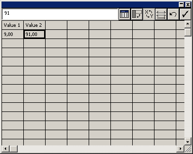
In the pop-up spreadsheet-like dialog enter Value 1 in the first cell, and 9 the cell below.
Step 03
Enter Value 2 in the second cell of the first row, and 91 in the second cell of the second row.
Step 04
Click on the Tick icon in the top-right corner to Apply. Close the dialog (click Yes if it asks whether to save data).
Step 05
You will notice that Illustrator adds the legend by default. To modify it, right-click on the graph and select Type… from the menu. Under the Options section, select No Legend.
Step 06
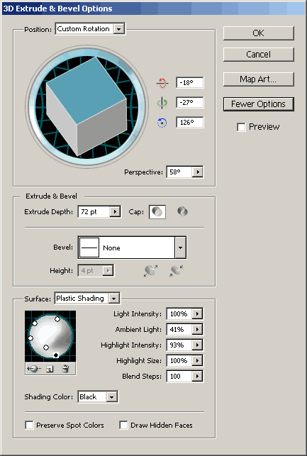
Now add some 3D look. Select the chart and go to Effect -> 3D -> Extrude & Bevel. I used -18, -27 and 126 degrees for the custom rotation, with 58 degrees of perspectiv and 72 pts for the extrude depth. No bevel was used and the default plastic shading was applied.
Step 07
To make your chart shine, click on More options in the Extrude & Bevel dialog and add more lights. Here you can see my settings:
Step 08
Remove the chart’s outline and assign custom colors to the slices by selecting them with the Direct Selection Tool (default shortcut A).
Step 09
To make a slice stand out a bit, use the Direct Selection Tool and move the slice a little away from the chart.
Step 10
Use the Rotate Tool (default shortcut R) to rotate the chart if needed.
Add some fancy shadow and your chart is ready. I used an ellipse with radial gradient fill (going from transparent black to opaque black). If you are making several charts it is recommended to turn the shadow into a symbol so you can modify it easier later if you wish.
Making More Charts
Alt+drag a chart to make a duplicate. Right-click on it and select Data…, then modify the values according to your needs. Make sure the sum adds up to 100, that is, 100%. You can add more columns if you need more slices.
Use the Direct Selection Tool to arrange the slices and to assign new colors, and rotate the chart if needed. You may need to modify the 3D rotation settings (select the chart and go to the Appearance panel and click on the 3D Rotate & Bevel item).
If all went fine, you could end up with such beautiful pies:

Download
You can download the Illustrator CS4 file here.
0 comments Comments